Case Study: Illustration for Web

The Brief
Coursearch is an upcoming search portal designed to help prospective students find a higher education course that is right for them. The brief required four illustrations: a 404 error image; maintenance image to appear on the temporary splash page; an image to appear after the submission of the enquiry form; and a cover image to be used on their Facebook page. I also created a matching favicon.
I was asked to create something fun and playful, with a limited colour scheme, that fit within the existing design of the site. Requirements included using their existing typeface and logo and fitting within set dimensions.
Initial Ideation
There was no direction given as to the content of the illustrations, so I focused first on the 404 error image as I felt this was the most crucial - while it wouldn't be seen most frequently it is the one that people will most likely be frustrated to see. Therefore, it had to be as playful and fun as possible, in order to alleviate that potential frustration and help to prevent an overall bad experience with the website.
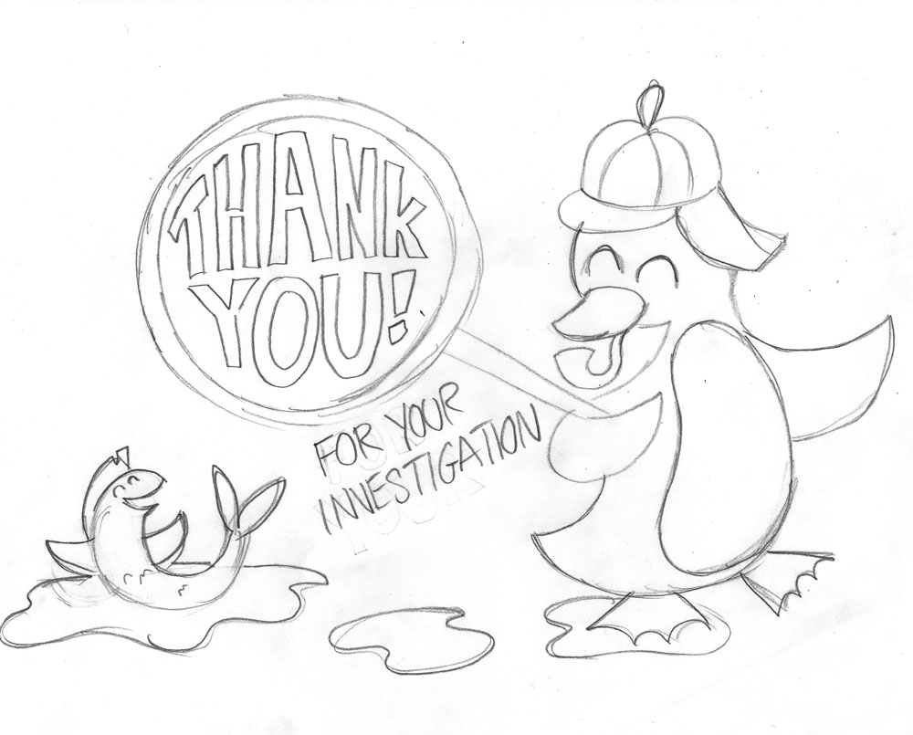
I began by brainstorming concepts as to where the missing page could have disappeared to. Below are a few of the concepts submitted to the client for consideration. I work with quite rough sketches in these early stages, as I prefer to refine my work digitally.


Refinement
The client chose the first concept of a lost penguin and, after some discussion, we decided to make him a detective to fit with the purpose of the website. The rough sketch was refined and approved and I worked on a colour scheme to fit with the website. I decided to use the green of the text with the pink, orange and pale blue of the logo. While there were more colours that could be used in the logo, I felt that any more would be too busy and lose its impact. Happily, the client was enthusiastic about my initial digital version and colour scheme and the first illustration was approved.
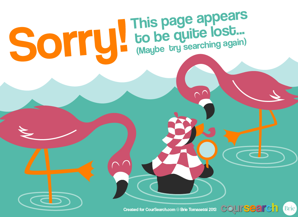
The approved 404 error image.
Continuing the Series
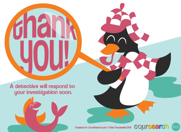
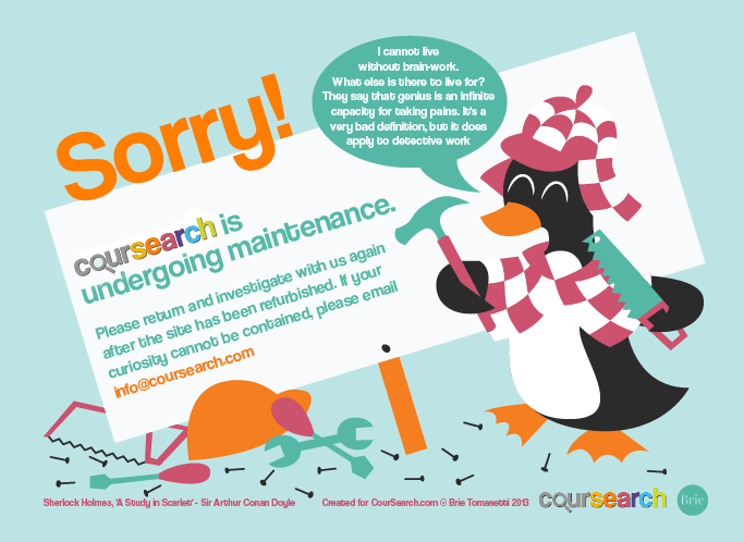
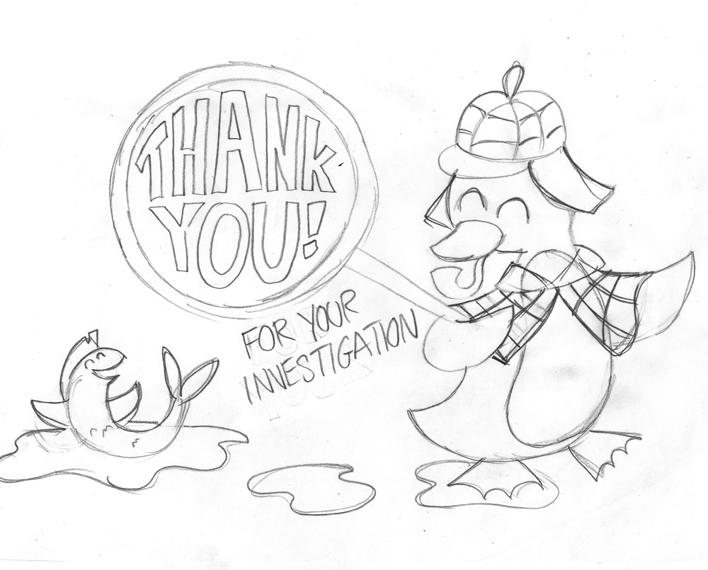
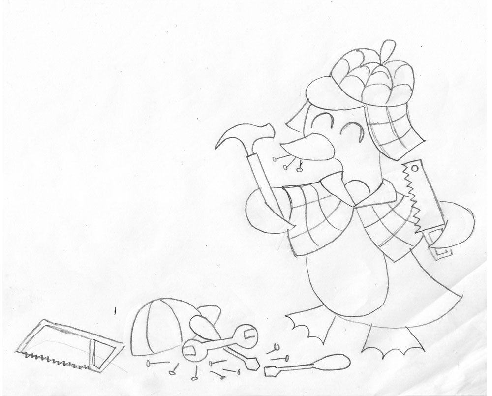
After the colour scheme, theme and general style were approved in illustration one, I created sketches for the maintenance and form submission pages. The maintenance image would be the only thing on the page when it was in use, so we opted to go for something a little more informative and busy. The thank you image was kept very simple and went through a slight revision to make the Sherlock reference more apparent.
I also liked the idea of including a literal "red herring" in the illustration. While it isn't immediately obvious to someone not familiar with detective tropes, the idea of having a secret clue in the form of a literal false clue felt like a fun element to include.
The Final Elements
Once the three main illustrations were created and approved the imagery was used to create a cover image for the Facebook page and a favicon.

Created to fit within Facebook's page cover template.
If you have an illustration project in mind that you think I would be a good fit for, please don't hesitate to contact me via my contact form or directly at contact@briedesign.com.au.