Case Study: Identity & Poster Design
“Brie completed a full design portfolio for our Musical, which involved designing images for social media and our website, printed advertising material, the programs and working with the set designer on set elements. She worked with over 5 people with strong ideas to build a portfolio that suited everyone in a short timeframe.
The quality of Brie’s design work impressed us all. I would strongly recommend her as a graphic designer to anyone”
The Brief
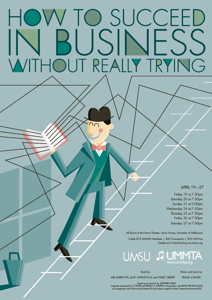
UMMTA'S production of "How To Succeed In Business Without Really Trying", was a comedic musical production put together by the University of Melbourne Music Theatre Association, a student-run musical theatre company in Melbourne.
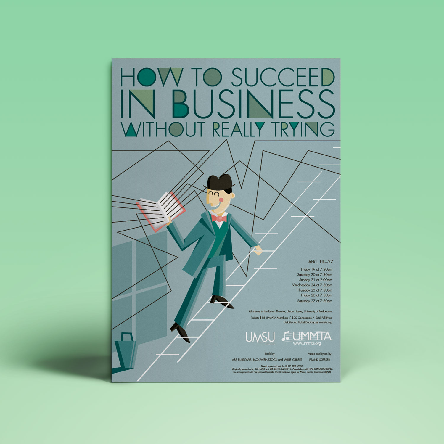
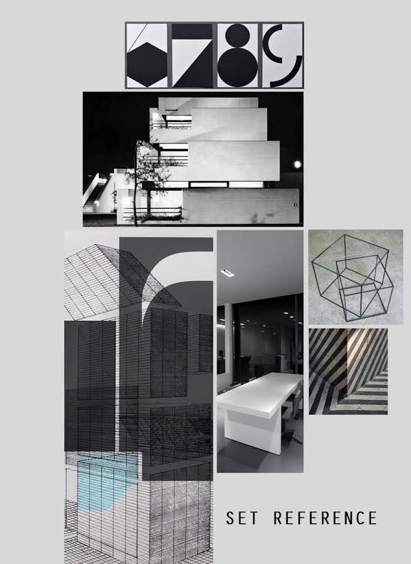
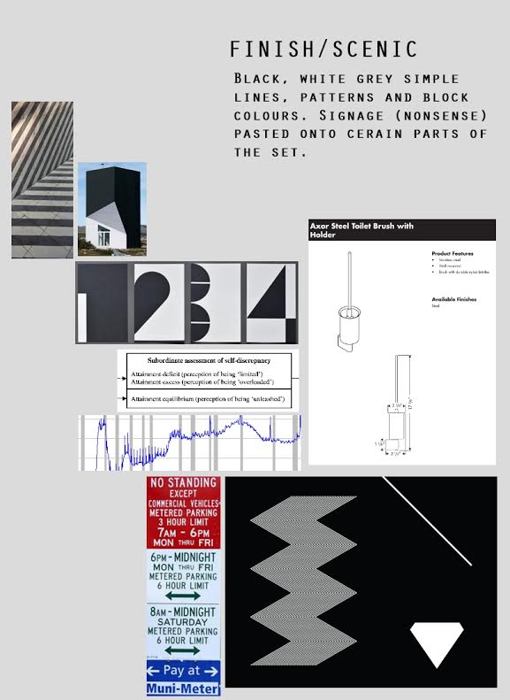
I initially met with the director, set designer and production team to discuss the themes of the show and the artistic direction already under way. I was asked to create a hero image which could be used across posters and other promotional collateral, including on social media and their dedicated website. It needed to be very geometric, clean and mechanical, but still whimsical with a clear sense of fun. The musical is also set in the 1950s, so a retro feel was desirable and the idea of climbing the hierarchy of an organisation needed to be the central theme. I was provided with the below as a visual guide.
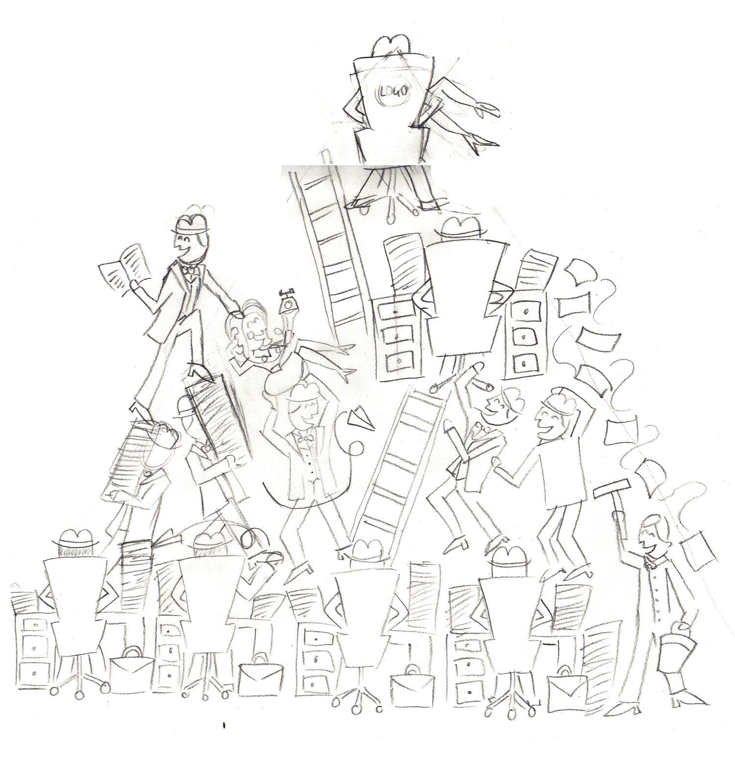
Initial Ideation
At this stage of the process I work very roughly, it's about communicating the idea more than the presentation. My initial concept involved a chaotic literal pyramid documenting each stage of the journey up the corporate ladder of the hero, Finch. However, we soon decided that for the purposes of a poster there was too much detail to be immediately eye-catching. Instead we cut back to only Finch and a shadowy line of replacements, and reserved elements from the initial sketch for later use. It later variations even the shadowing people were removed.
For the design of the characters I focused on sharp corners and the use of line. I wanted them to be quite pared back, with the emphasis on the geometry of their design rather than defining features. I felt this complimented the reference material I was provided.
Refinement
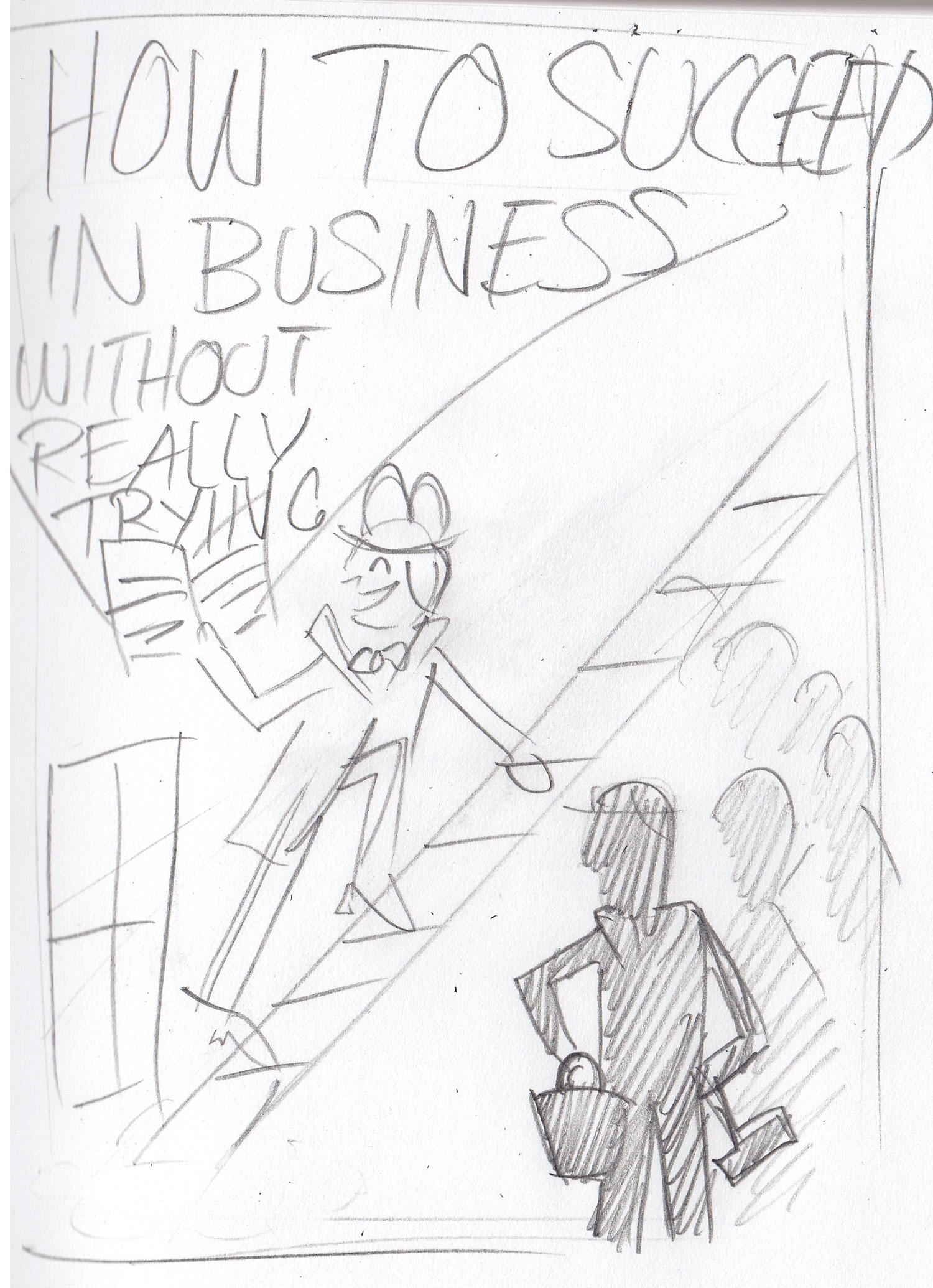
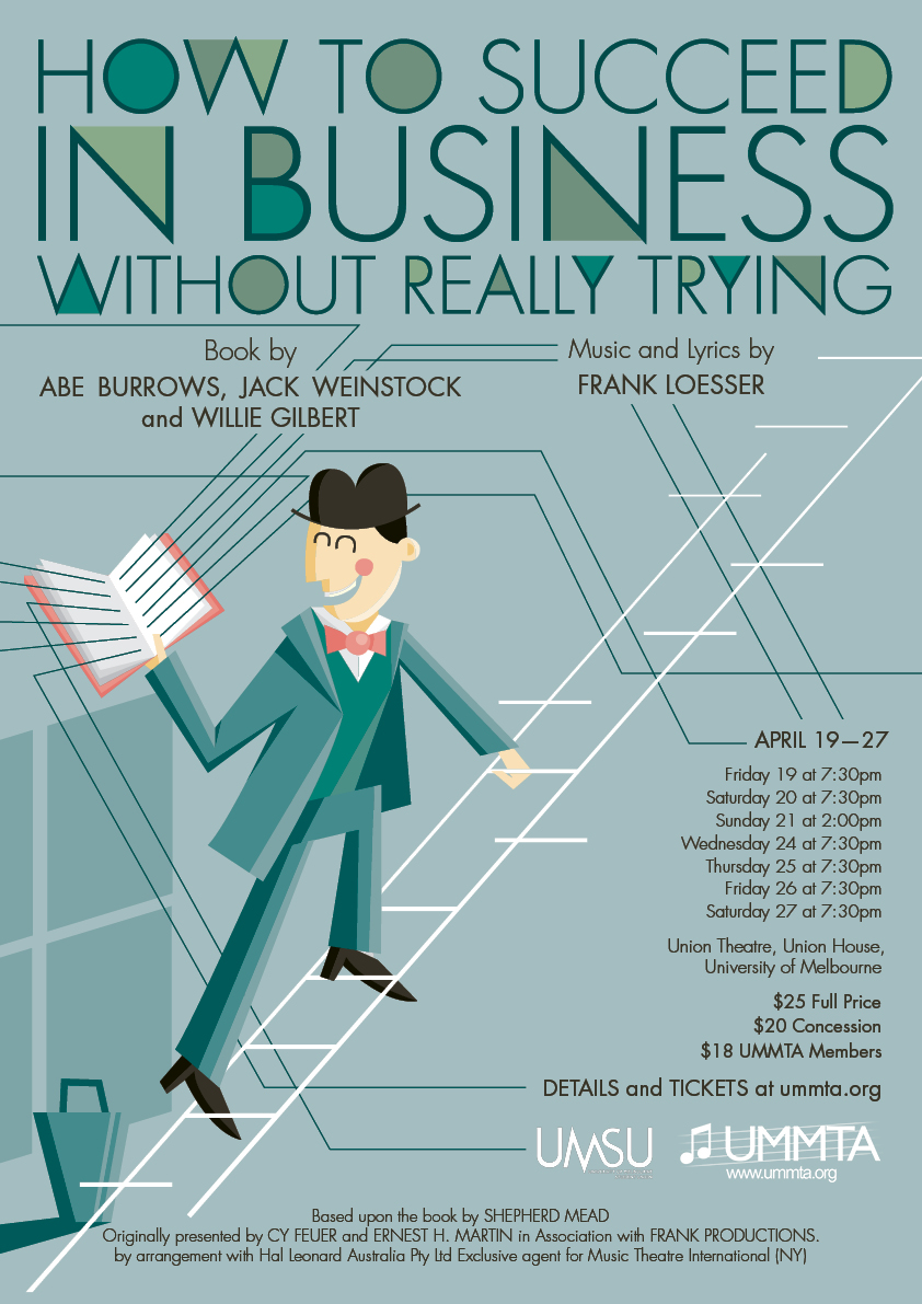
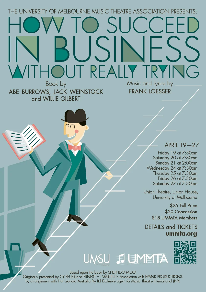
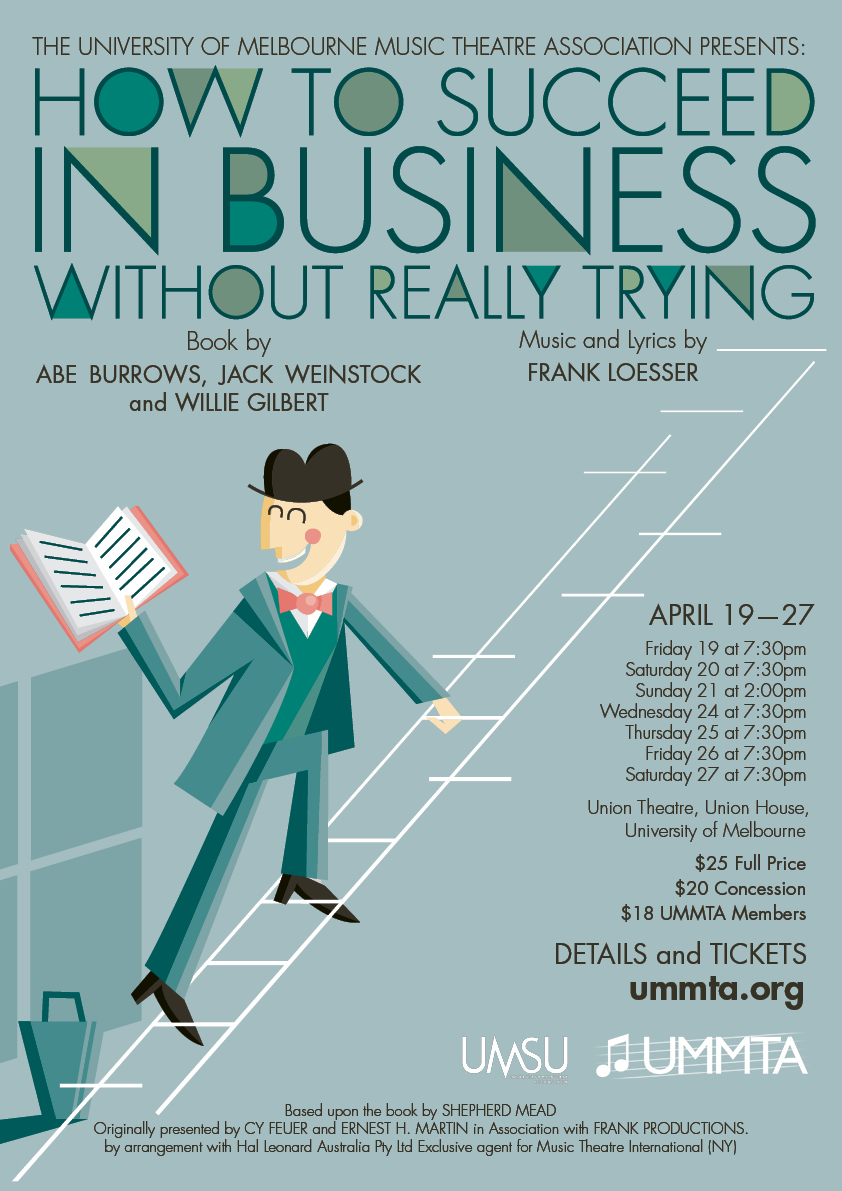
The more variations created the more paired back the design became, resulting in a much cleaner final design. Initially I'd played with the idea of geometric shapes used to create the main title. However, upon feedback it was decided that it would too difficult to read at a glance and I chose a simpler typeface with a reference to the geometry within the glyphs.

The initial typeface for the production. It was decided that it wasn't clear enough on first glance.
It was also essential to get the balance of text to image correct so that it would suit the A3 format, so numerous revisions were created based upon the feedback of the client as well as printed tests. In the end we reached a design that all parties were happy with, whilst also meeting all the copyright requirements set out in the production's license.
Branding Collateral
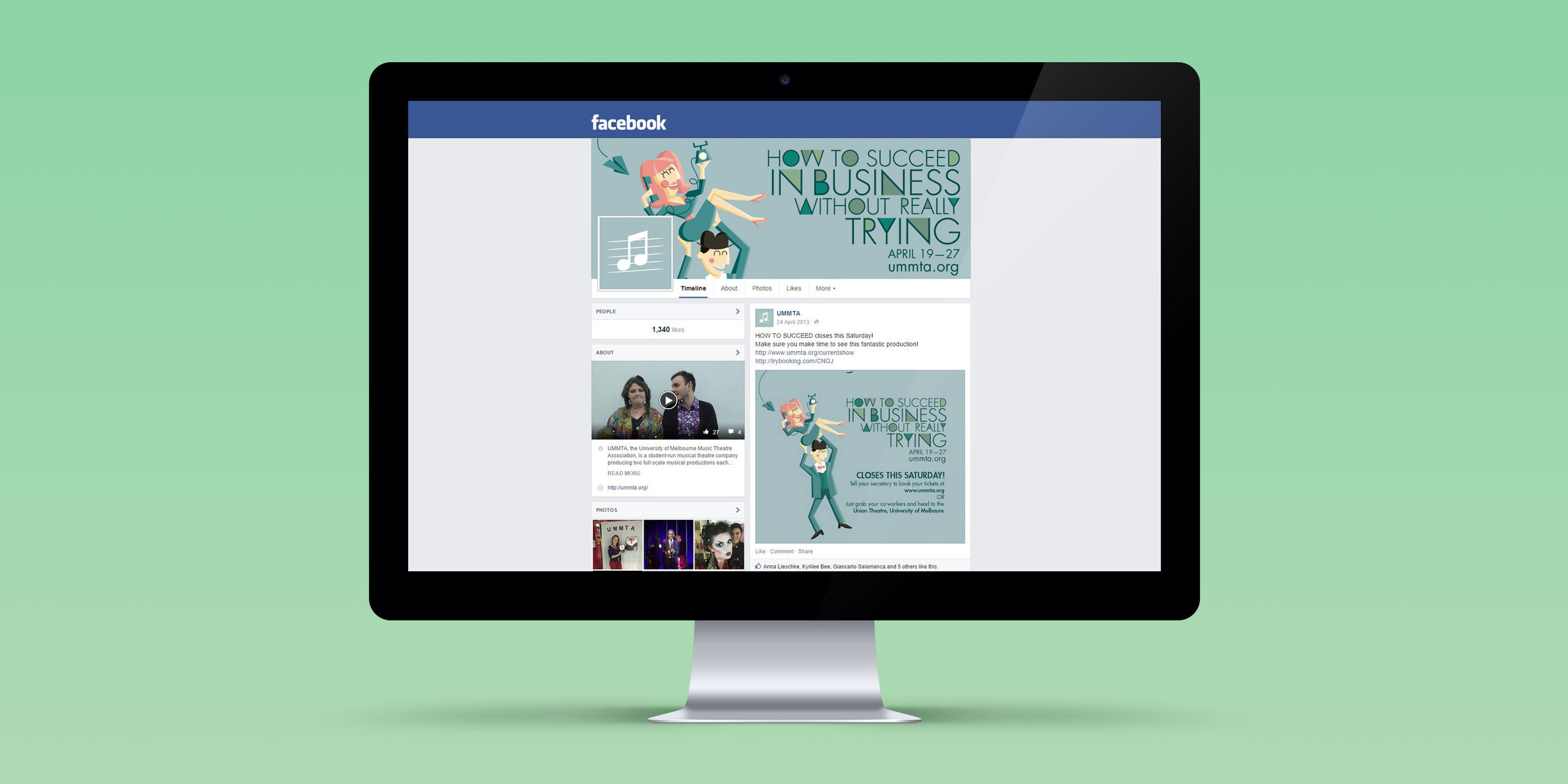
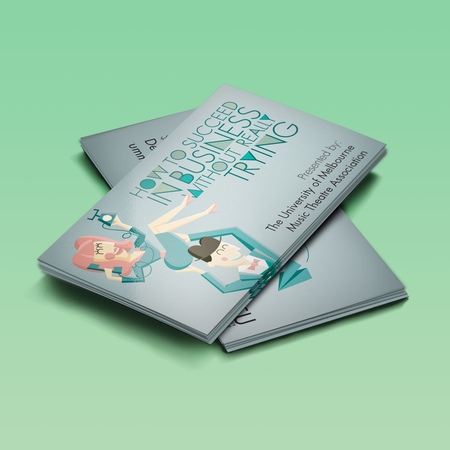
In order to apply the branding across print and the web, I created an additional illustration. This was used on business cards, as a thematic variation on the usual postcards usually created for UMMTA's productions, as well as for imagery to be used on social media and to brand the production's dedicated website.
As a style and colour scheme were already created this was a much faster process. The element I chose to use from my initial concept sketch was the man holding up a female secretary, inspired by the musical number "A Secretary is Not a Toy".

The additional image, as used by the communications coordinator on Facebook.
I also created a few paper airplanes, to be used as extra elements across the branding as the production team saw fit.
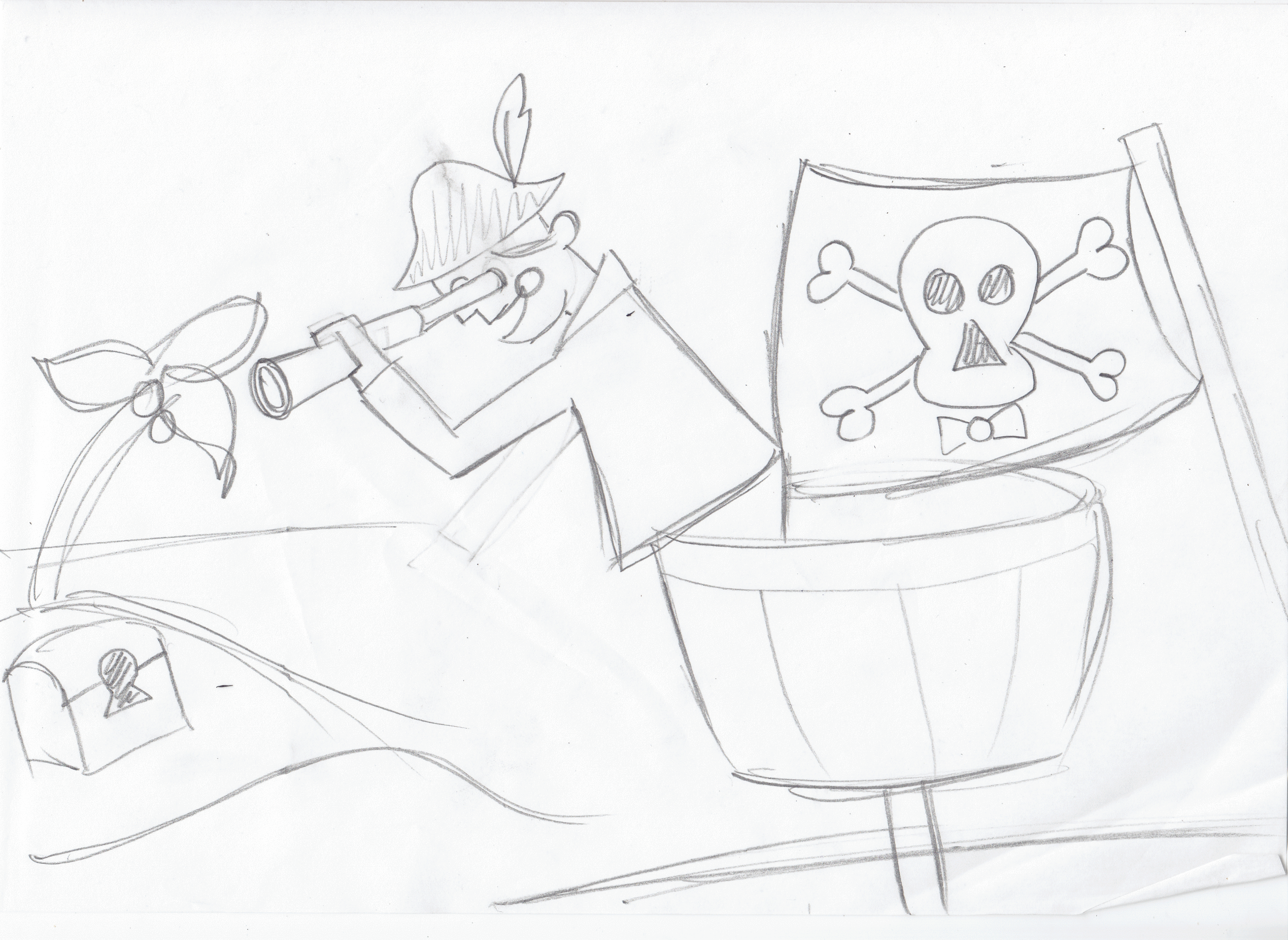
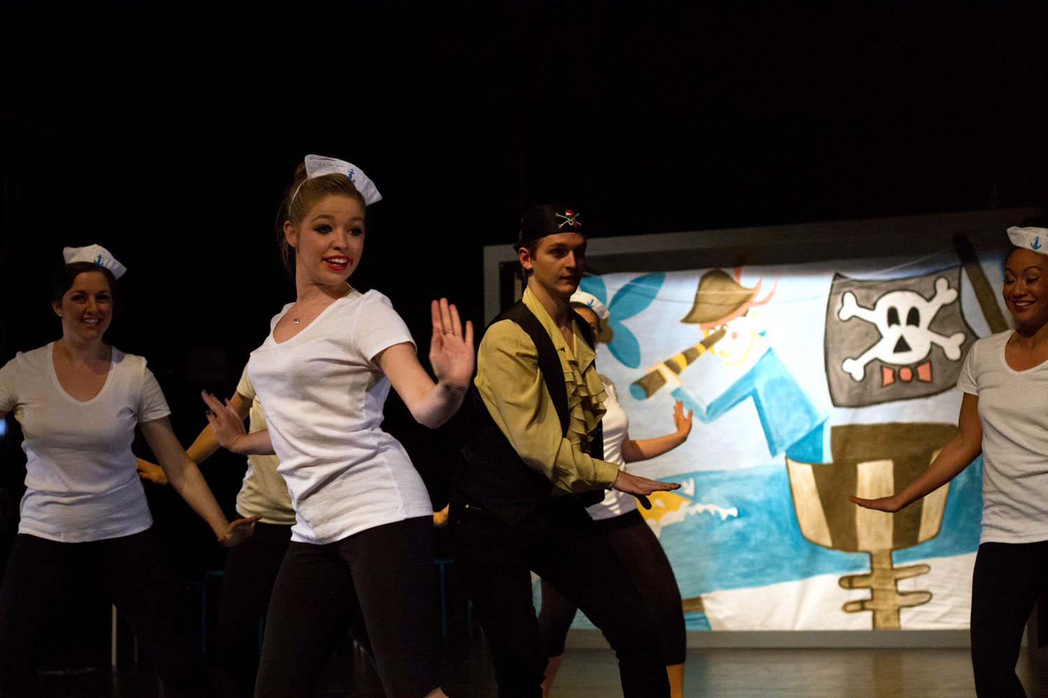
Finally, I created a sketch to be used as the basis for a painted set piece. I created the reference image and it was painted by the production team.

If you have a design project in mind or need branding created for your event or company, please don't hesitate to contact me via my contact form or directly at contact@briedesign.com.au.